
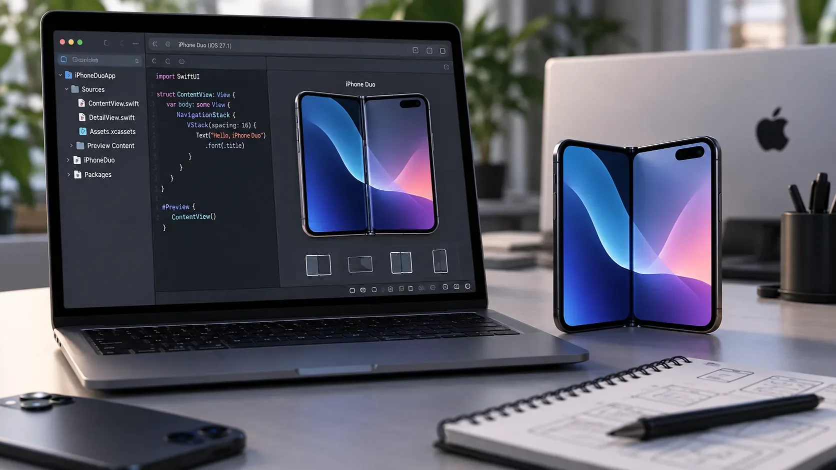
iPhone Duo changes the testing routine because the same app can appear on the compact outer display, the wide inner display, in partially folded poses, and in multitasking layouts. There is one important limitation for teams starting now: as of September 17, 2026, Apple says development support for iPhone Duo will arrive in Xcode 27.1, with updated SDKs and a simulator capable of reproducing the new poses and orientations, and that the beta will be available later this month. The device ships on October 23 with iOS 27.1.
That splits the work into two stages. Before the beta, fix everything that already prevents the app from resizing well. Once Xcode 27.1 with Duo support is available, move on to Duo-specific validation for folding, reserved regions, multitasking, scenes, and size transitions. Apple centralizes its preparation material in Get ready for iPhone Duo and details Xcode availability in its September 16, 2026 update.
What Xcode 27.1 adds to iPhone Duo testing
According to Apple, Xcode 27.1 will add the SDKs and simulator needed to run and test apps for iPhone Duo. The key point is not simply having one more screen size. The simulator needs to represent different poses and orientations because the system rearranges bars, safe areas, content, and multitasking possibilities depending on whether the device is closed, open, or partially folded.
In practice, the simulator should become part of a test matrix, not a single layout snapshot. Apple recommends treating the interface as resizable and adaptive. In Design for iPhone Duo, Apple advises against fixed widths, breakpoints tied to a specific resolution, and separate layouts for every pose. The main focus should be two size classes: compact width on the outer display and regular width on the inner display.
What you can review before the Xcode 27.1 beta
The best use of time before the dedicated simulator arrives is to remove dependencies on rigid dimensions. An app that already handles resizing well on iPad, iPhone Mirroring, and variable windows starts from a stronger foundation for Duo.
- Remove fixed widths and heights when they are not essential. Components should react to available space instead of a device model hardcoded into the layout.
- Review size classes. In SwiftUI, UserInterfaceSizeClass and the horizontal and vertical size class environment values help drive decisions from available space. UIKit uses the equivalent trait and size class model.
- Prefer standard navigation. Apple highlights that components such as NavigationSplitView, UISplitViewController, TabView, and UITabBarController adapt across poses and sizes.
- Test content in narrow and wide spaces. A screen that works only when fully open is not ready. The same flow must remain understandable when width drops to the compact class.
- Avoid positioning controls with absolute coordinates. Bars, buttons, and interactive elements need to follow margins, safe areas, and axis changes.
Test matrix to run when the Duo simulator arrives
| Scenario | What to inspect | Typical failures to look for |
|---|---|---|
| Outer display, device closed | Compact class, navigation, vertical bars, camera, and safe area | Hidden content, clipped controls, compressed text, overlapping bars |
| Inner display fully open | Regular class, use of extra space, two columns or sidebar when appropriate | Overstretched content, excessive empty space, lost visual hierarchy |
| Partially folded like a book | Central fold region, displacement of content and controls | Buttons in the crease, text or images that are hard to read in the center, gestures crossing the fold |
| Partially folded in portrait orientation | Vertical distribution, control reachability, and adaptation to usable space | Important actions in the less reachable half, elements over the fold area |
| Side-by-side Split View | Continuous resizing, size classes, scene geometry | Layouts that depend on a rigid minimum width, modals or menus outside the available area |
| Pinned video with the app resized | Real-time height changes | Clipped content, broken scrolling, controls off screen |
| Rotation and pose changes | Layout reflow without losing context | Navigation resets, layout flashes, inconsistent visual state |
| Multiple scenes | Window creation and restoration where supported | Unhandled errors, incorrectly shared state, actions shown on the wrong display |
The fold should not become a manual breakpoint
One of the easiest mistakes is turning the hinge angle into a layout rule. Apple separates two needs. For effects and interactions, SwiftUI provides onHingeChange and UIKit provides UIHingeInteraction, both of which expose hinge state and angle. For layout, however, Apple recommends region and arrangement APIs rather than the raw hinge angle. This distinction is explained in Leverage multiple displays and scenes on iPhone Duo.
This avoids building dozens of conditions such as “if the device is at 70 degrees, move the button.” Layout should respond to usable space and system-provided regions. The angle can drive an animation, game effect, or another continuous interaction, but it should not replace interface geometry.
Safe areas and ReservedRegion: where the fold actually affects layout
Duo includes areas that should not always contain interactive content. Apple calls them reserved regions. They include the division region created by the fold when the device is partially open and occlusion regions such as the camera. In Strike a pose with adaptive layouts on iPhone Duo, Apple explains that the fold region is active when the device is partially folded. When the device is completely flat, that region is inactive and has zero width.
For typical interfaces, the safest path remains system components and bars, which already respect safe areas and avoid the fold. For custom and edge-to-edge UIs, iOS 27.1 introduces ReservedRegion in SwiftUI and UIViewReservedRegion in UIKit. They let an app query regions that divide or occlude content and position elements without colliding with hardware or system UI.
Do not assume margins are symmetrical. Apple asks developers to test safe areas and layout margins on each side, including in Split View. Backgrounds and decorative images can extend beyond the safe area when that is intentional, but text, buttons, and other interactive elements should stay in readable and tappable regions.
Breakpoints: use available space, not the device name
For Duo, the practical rule is simple: do not create a separate “iPhone Duo” path if the same result can be achieved by adapting to available size. The outer display is a compact case. The inner display is a regular case. Within those two families, the app can still lose width or height because of multitasking, pinned video, bars, and orientation changes.
A robust layout should respond to those changes without relying on a resolution list. In a catalog screen, for example, the interface might move from one column to two when there is enough space. In an information-dense app, a sidebar may make sense on the inner display. A simple screen may keep one column and just use margins and extra space more effectively. The criterion should be interface clarity, not simply whether the device is open.
App state: resizing must not mean starting over
Apple emphasizes that iPhone Duo supports multitasking and multiple UI instances. It is the first iPhone where an app can have multiple UI scenes, a behavior already familiar on iPad. There is an important difference: new windows can be created on the inner display, but not on the outer display. Apple recommends handling failures when requesting new scenes and points to UIWindowSceneActivationAction, which automatically hides when creating new windows is unavailable.
Beyond the official scene requirement, include state continuity tests in the product checklist. When switching between outer and inner displays, changing orientation, entering Split View, or changing pose, verify that the app preserves what the user was doing. This includes navigation, unsent text, current selection, media playback, filters, and other relevant context. This is an app quality test, not an automatic system guarantee.
- Open a deep screen, change pose, and confirm navigation stays at the same point.
- Enter content in a form, resize the window, and verify nothing is lost.
- Start media or a long-running task and test size and orientation changes.
- Open a second scene on the inner display, where supported, and confirm each window keeps the correct state.
- Try requesting a new scene where it is unavailable and confirm the app handles the case without a visible error.
What still depends on the beta and final documentation
As of September 17, it is not yet possible to close every detail of the testing workflow because Apple has not publicly released the Xcode 27.1 beta with iPhone Duo support. Until that version arrives, the exact simulator presets, controls for switching poses and orientations, possible SDK known issues, and any API changes before launch still require practical confirmation.
That is why presentation videos should not be treated as the final implementation contract. Use the published principles now to fix resizability, navigation, and safe areas. Then validate behavior in the Xcode 27.1 simulator, reread the corresponding release notes, and perform a final pass on real hardware as soon as you have access. The simulator is ideal for geometry, layout, and many state flows, but it cannot fully replace physical validation of ergonomics, cameras, folding behavior, and performance.
Adaptation checklist before launch
- Remove rigid dimensions that prevent resizing.
- Review layouts in compact and regular size classes.
- Adopt adaptive navigation components and bars whenever possible.
- Ensure interactive content respects asymmetric safe areas.
- Plan ReservedRegion or UIViewReservedRegion only where custom UI requires it.
- Do not use hinge angle as a replacement for layout APIs.
- Test outer display, inner display, partially folded poses, rotation, and height changes.
- Test Split View and resizing with pinned video.
- Validate state preservation during resizes and transitions.
- Review multiple-scene support and handle unavailable new-window requests.
- Run the matrix again when the Xcode 27.1 beta with the Duo simulator is published.
- Repeat testing after final release notes and, when possible, on a physical iPhone Duo.
In short
Preparing an app for iPhone Duo does not mean creating a different interface for every fold angle. The main job is to make the UI genuinely resizable, respect size classes, safe areas, and reserved regions, and preserve user context as geometry changes. On September 17, 2026, that preparation can already begin, but Duo-specific simulator validation depends on the Xcode 27.1 beta Apple says is coming later this month. The strongest strategy is to reach that beta with existing resizability problems already fixed, then use the simulator to test what the new hardware uniquely introduces.