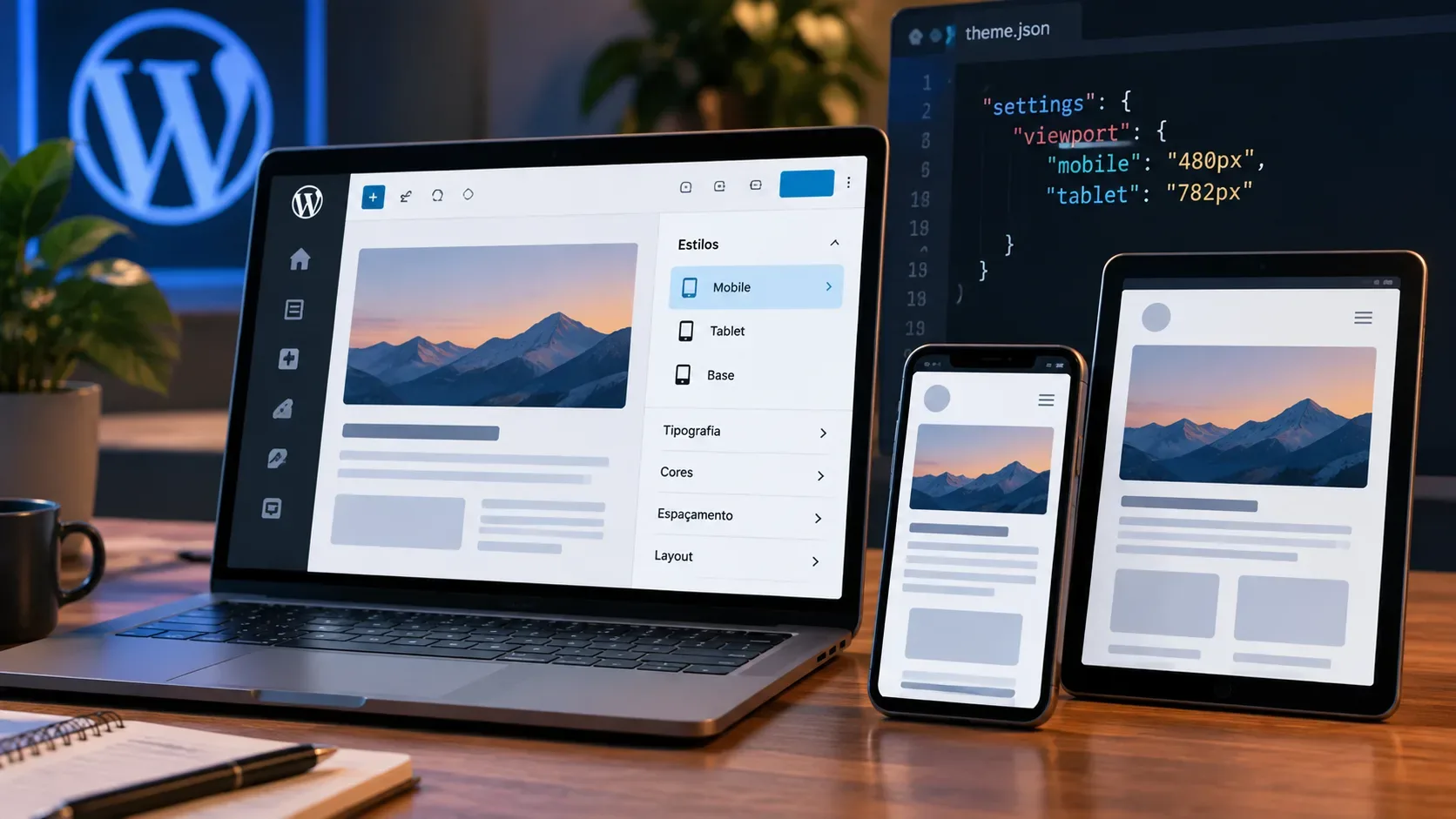
WordPress 7.1, released on August 19, 2026, added responsive block style states for Tablet and Mobile directly to the styling system. In practice, there are two paths: editors can change style properties by viewport without hand-writing media queries, while theme developers can define the same states in theme.json and customize the Mobile and Tablet limits.
The model is desktop-first. A block’s normal style is the base and continues to apply at every size until a property is overridden under @tablet or @mobile. That is why there is no @desktop key.
Which breakpoints WordPress 7.1 uses by default
| State | Default range | What happens |
|---|---|---|
| @mobile | width ≤ 480px | Values defined for Mobile override the base within this range. |
| @tablet | 480px < width ≤ 782px | Tablet values apply above Mobile and through the Tablet limit. |
| Base | above 782px by default | No special key is used; this is the block’s normal style. |
The theme can change these limits. The official documentation also states that configured viewport widths are used by responsive block styles and block visibility and are previewable through the editor’s device preview.
Path 1: use responsive styles directly in the editor
For a one-off edit, the simplest workflow is the editor’s device selector. Turn on responsive editing, switch the preview to Tablet or Mobile, and then change a block style property. The change is stored for the active viewport.
- In the block editor, open the device preview selector in the top toolbar.
- Turn on Responsive editing.
- Select Tablet or Mobile, or resize the editing canvas into the target range.
- Select a block with style support and change a property such as font size, color, border, spacing, dimensions, or layout.
- Return to Desktop to confirm that the base value was preserved.
- Check the other smaller viewport to see whether it inherits the base or has its own override.
The behavior is inheritance-based: if you set a font size on Desktop and do not change that field on Tablet or Mobile, the same value remains in effect. Only the property changed at the smaller viewport is overridden.
What is responsive and what remains global
Responsive states apply to properties exposed through block style supports, including typography, color, background, border, dimensions, spacing, and layout. This does not make every editor control viewport-specific. In the official WordPress 7.1 testing guidance, for example, block toolbar controls such as alignment still applied to all devices, while style controls in the inspector sidebar were the focus of per-viewport editing.
Path 2: declare @mobile and @tablet in theme.json
Theme authors can store responsive states alongside each block’s styles. The example below keeps 3rem padding as the base and reduces it to 1rem only on Mobile:
{
"styles": {
"blocks": {
"core/group": {
"spacing": { "padding": { "top": "3rem", "right": "3rem", "bottom": "3rem", "left": "3rem" } },
"@mobile": { "spacing": { "padding": { "top": "1rem", "right": "1rem", "bottom": "1rem", "left": "1rem" } } }
}
}
}
}
The same pattern works with @tablet. Viewport states can also be combined with pseudo-states: the documented nesting order is viewport first and pseudo-state second, such as @mobile containing :hover.
How to change breakpoints with settings.viewport
Breakpoint limits are configured at the top level of settings, not inside a specific block. For example:
{
"settings": {
"viewport": {
"mobile": "30rem",
"tablet": "45rem"
}
}
}
With both values valid, this creates a Mobile range up to 30rem and a Tablet range above 30rem and through 45rem. Everything else continues to use the base.
Which units are accepted
WordPress 7.1 accepts non-negative numeric lengths using px, em, or rem. Percentages, unitless values, CSS functions, and other units are ignored. Values such as 480px, 30em, and 30rem are therefore compatible, while 50%, 480, or a CSS function expression do not meet the documented rule.
What happens when a breakpoint is invalid
- If only Mobile or only Tablet is valid, the valid state keeps its name and uses a single maximum-width query.
- If neither value is valid, WordPress falls back to the 480px and 782px defaults.
- If both are valid but Tablet is less than or equal to Mobile, only the Mobile breakpoint is used.
- settings.viewport is global to the theme; it cannot be configured with different values for each block type.
Why there is no @desktop
The lack of @desktop avoids duplicating the base style. If a Group has 3rem padding in its normal declaration, that value is the starting point at any width. A @tablet rule can change only the padding while color, border, and other properties continue to inherit. A @mobile rule can override only what needs to change again.
This is important both for keeping configuration concise and for understanding the cascade: Tablet and Mobile are exceptions to the base, not three independent style sets.
When to use the editor and when to use theme.json
| Scenario | Best starting point |
|---|---|
| Visual adjustment for one block on one page | Editor with responsive editing enabled. |
| Rule that should apply to every instance of a block type | Global Styles or theme.json. |
| Standardize breakpoints across the site | settings.viewport in theme.json. |
| Change Desktop only | Edit the base style; do not look for @desktop. |
Checklist before publishing
- Confirm that the site is running WordPress 7.1 or another version that supports the feature.
- Define the base first, then add only the Tablet and Mobile exceptions you need.
- Do not plan different breakpoints per component: WordPress uses the global settings.viewport values.
- Validate the units and keep Mobile < Tablet.
- Test with the editor’s device selector and by resizing the browser on the front end.
- Confirm that properties without overrides still inherit the base correctly.
Official sources
The implementation and limits are documented in the WordPress 7.1 developer note Responsive block styles and configurable viewports in WordPress 7.1, the Theme.json Version 3 Reference, and the Global Settings & Styles guide. The editor workflow was also detailed in Call for Testing: Responsive Styling. The final WordPress 7.1 release shipped on August 19, 2026, according to the official release announcement.