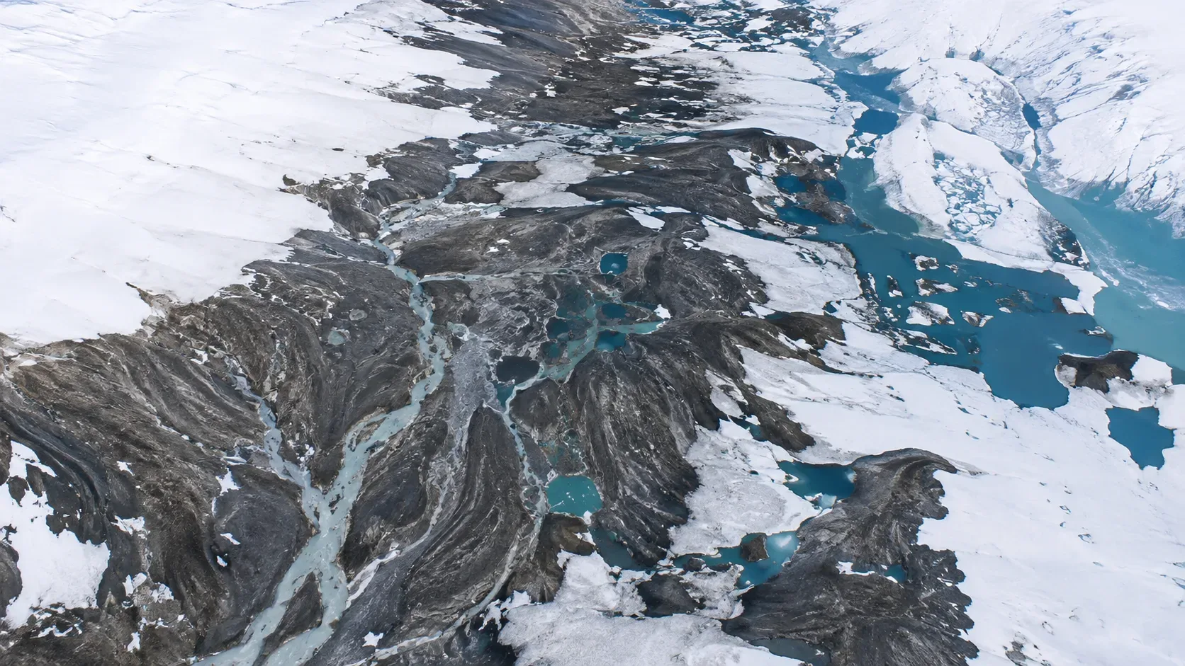
Blue draws attention, but the most important sign in the Barnes Ice Cap image is the absence of white.
Published by NASA Earth Observatory on August 3, 2026, the scene was acquired on July 12 by the OLI-2 sensor on the Landsat 9 satellite. It shows much of the ice cap without its seasonal snow cover, with exposed darker ice, turquoise pools, and an extensive network of meltwater channels. The snow had disappeared early, leaving visible features that normally stand out later in the summer.
The image is clear evidence of the state of the surface that day. It is not, however, a scale capable of reporting alone how much ice the Barnes Ice Cap has lost throughout the year — nor does it individually identify the cause of each observed change.
Before you look for blue, look for snow
For much of the year, Barnes Ice Cap is covered in snow. In summer, this layer recedes and can reveal the glacial ice accumulated beneath it. In 2026, the ice cap entered the melting season with an already thin layer of snow and went from covered to mostly exposed in a few weeks. By mid-July, coverage was virtually absent.
Glaciologist Mauri Pelto, cited by NASA for monitoring the region with Landsat images and field observations when available, classified that moment as the earliest he had seen the cap so exposed. The statement should be understood within this monitoring series, and not as an announcement of a global climate record. The Barnes Ice Cap has also been snowless in previous summers, such as 2019, 2020 and 2024, but this occurred later in the season.
This temporal distinction is essential. A snowless cap at the end of summer and an almost snowless one on July 12 may look similar, but they do not tell the same story. The sooner dark ice is exposed, the longer it remains directly subject to solar energy during the remainder of the season.
How to read the top five elements of the image
1. The white areas: remaining snow
The whiter parts correspond mainly to the snow that still remained on the ice or in nearby areas. In the image from July 12, they occupy a small portion of the cap.
The distribution of these patches helps assess the stage of the melt season. What draws attention in 2026 is not just the existence of exposed ice, something expected in summer, but the extent of this exposure at such an early date.
The image allows you to map where the snow was still visible. It does not inform, without additional analysis, the thickness of each stain nor the total amount of water stored in it.
2. The darkest gray: exposed glacial ice
When the snow disappears, glacial ice appears, which may appear gray, bluish, or slightly brownish. Its surface contains irregularities, sediments and layers formed over time.
Exposed ice reflects less solar radiation than clear snow. Because it is darker, it absorbs a larger fraction of the energy received, favoring the heating and melting of the surface. This is a physical mechanism known as albedo difference: removing the white covering changes the way the surface interacts with sunlight.
This does not mean that the color of each pixel works as a thermometer. The tone also depends on the spectral bands used, lighting, surface humidity, sediment and the processing applied to the image.
3. The blue puddles: water accumulated on the surface
The intense blue spots are pools of meltwater formed in depressions in the ice. They confirm the presence of liquid water on the cap at that time.
Vivid blue is visually striking, but should not be interpreted as a direct scale of depth or volume. A small, deep puddle and a wide, shallow puddle can produce different optical signals. Reflections, suspended particles and image processing itself also affect color.
To calculate how much water is stored, it would be necessary to combine the area of the pools with information about depth, topography and temporal evolution.
4. The branching lines: meltwater channels
The lines that resemble roots or fingerprints are supraglacial channels: waterways that cross the surface of the cap. Many start from higher elevations and connect to the ice edge.
A study published in 2026 in the Journal of Glaciology found that the Barnes Ice Cap is crossed by channels from its highest to its lowest elevations. The researchers observed that many of these routes remain in approximately the same places for years and come back into use in different seasons. This stability allows the drainage to quickly reorganize itself when meltwater reappears.
Maps produced in the study with images from 1985 to 2024 show the recurrence of these networks and their presence in successive periods of five years. The channels visible in 2026, therefore, were not necessarily born that summer: part of them correspond to persistent depressions shaped and reused by water.
5. The curved lines and the brown band: history of ice and margin retreat
Gray, faint, curved lines cross some areas of the surface. NASA associates them with layers of snow and ice accumulated over many millennia. They become more apparent when new snow stops hiding old ice.
A light brown band observed along the central-southern margin corresponds to terrain and rock recently exposed by the retreat of the ice. This band is different from the dark areas on the cap: it is outside the current margin and represents soil that previously remained covered.
A single scene shows the position of the bank that day. To determine how much it has receded, it is necessary to compare it with previous images, using the same reference points and taking into account the resolution and geographic precision of the data.
Why losing snow early could worsen melting
Snow acts as a light, reflective surface. When it disappears, darker ice absorbs more solar energy and can melt more intensely. The early onset of this exposure extends the period in which this mechanism operates during the summer.
Snow can also temporarily store some of the water produced by melting ice. This water can percolate between the grains and refreeze. The intermediate material between snow and glacial ice, called firn, is formed by snow that is more than a year old, compacted and partially transformed.
When there is almost no snow or firn available, more of the water can enter directly into the canals and leave the cap. In 2026, the early loss of cover and the reappearance of channels indicated that surface runoff also started early. Even so, only monitoring until the end of the season will be able to show the net result for the year.
What the image shows — and what requires other data
| Image from July 12 holds | Isolated image does not determine |
|---|---|
| Snow was practically absent in much of the cap | The complete mass balance of 2026 |
| There was largely exposed glacial ice | The exact temperature of the entire surface |
| Puddles of water were present | The total volume and depth of these pools |
| Channels crossed the surface and reached the shores | The total volume of water that left the cap |
| Land was exposed along the current margin | How many meters did the bank retreat without historical comparison |
| Surface melting was active and advanced | A single meteorological or climate cause |
| The scene is unusual for that date | A global climate record |
The mass balance of a glacier is the difference between what it gains through accumulation and what it loses through ablation processes, such as melting. This difference is typically calculated for a period, often a year, and requires measurements or series of observations — not just one image.
The OLI used by Landsat 9 records radiation in the visible, near-infrared and short-wave infrared bands. Its multispectral images have a spatial resolution of 30 meters, in addition to a panchromatic band of 15 meters. The sensor is excellent for mapping surface coverage and tracking changes, but features smaller than its resolution may not be represented individually.
The long-term context of the Barnes Ice Cap
Located in central Baffin Island in the Canadian territory of Nunavut, the Barnes Ice Cap is a remnant of the ancient Laurentide Ice Sheet, which covered much of northern North America. Currently, it occupies approximately 5,700 square kilometers and reaches around 730 meters thick in some places.
Rippin and colleagues' study analyzed images and elevation models from different periods. At the central-south outlet examined by the researchers, the bank retreated an average of 158.14 meters between 1983 and 2023, equivalent to approximately 3.95 meters per year. Between 2000 and 2020, the average elevation reduction in this area was about 0.98 meters per year; for the entire cap, the estimate was close to 1.06 meters per year. Rates vary from point to point and should not be applied uniformly across the entire margin.
These historical series support the conclusion that the Barnes Ice Cap has been thinning and retreating. The July 2026 image adds an important observation to this context: that summer, the surface lost its snow early. It reinforces monitoring, but does not replace the measurements that established the decades-long trend.
A simple method for interpreting melt images
When you find a new image of a glacier or ice cap, follow five questions:
- When was the image taken? The date of capture is more important than the date the report was published.
- Which sensor produced the scene? Resolution, spectral bands, and processing affect what can be distinguished.
- Where are snow, ice, water, and terrain? These surfaces may be close in hue, but represent different processes.
- Is there a comparable picture from another year? Comparisons should use similar seasonal dates and consistent geographic references.
- Does the conclusion come from the scene or from a series of data? Look separately at what is visible, what is measured, and what is inferred.
In the case of Barnes Ice Cap 2026, direct observation is solid: the cap was largely exposed on July 12, with surface water and active channels. The broadest interpretation depends on comparison with other years and measurements of recoil, thickness and mass balance.
How to use the official image with correct credit
Current NASA guidance generally permits editorial and informational use of its materials, as long as there is no indication of third-party copyright, the source is acknowledged, and the publication does not suggest endorsement by the agency. The specific credit given for this scene is “NASA Earth Observatory/Lauren Dauphin, using Landsat data from the U.S. Geological Survey”.
Editorial annotations can be applied on their own layer, with a caption that identifies them as additions to the publication. The ideal is to preserve an unmarked version of the image, not hide relevant scientific features and keep the credit visible in the caption or immediately below the material.
Save this guide to reference when a new satellite image circulates without context and follow other visual explanations of scientific phenomena.