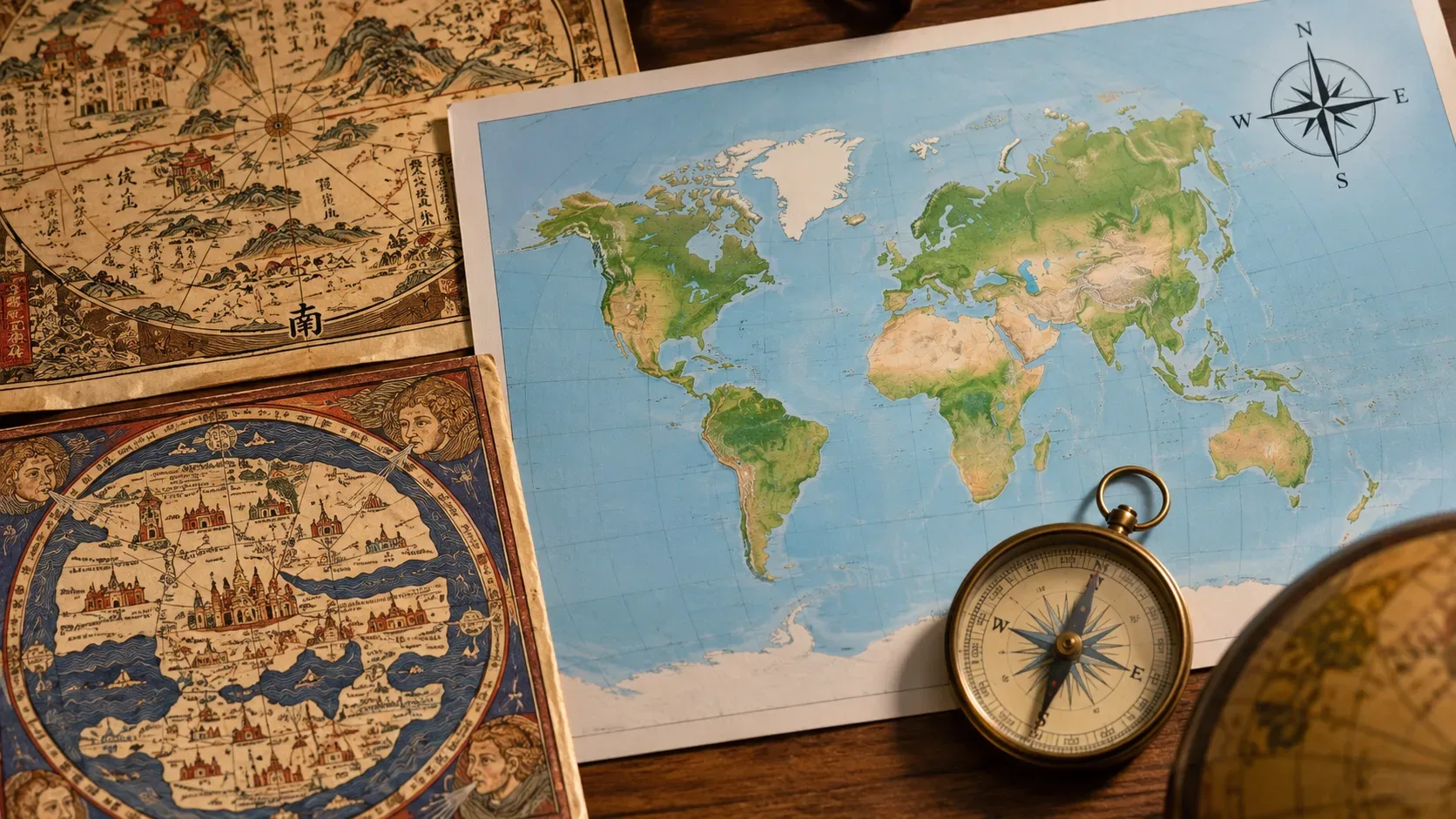
North appears at the top of most modern maps because that orientation became a dominant convention — not because Earth has a natural “up” side. A globe can be rotated in any direction; on a flat map, someone has to decide which cardinal direction will occupy the top. For centuries, mapmakers made different choices depending on purpose, intellectual tradition, religion, navigation, and audience.
The short answer: north-up is a convention, not a law
Putting north at the top helps readers who have learned to expect that orientation. That predictability is useful: it makes maps easier to compare, helps people locate regions quickly, and lets symbols and coordinates be read without relearning the frame of reference on every page. But nothing in Earth's geometry requires this choice.
The historical record makes that clear. At different times, maps have been oriented with east, south, or north at the top. Calling a south-up map “upside down” therefore describes only its relationship to today's convention; it does not mean the map is geographically wrong.
Before the modern standard, the top depended on the mapping tradition
In medieval Europe, many Christian mappae mundi placed east at the top. A text from Magdalen College, University of Oxford, explains that T-O maps could put the Far East — associated with Eden — at the top and Jerusalem at the center. In that setting, orientation and center supported a religious and historical reading of the world, not simply a navigational need.
In parts of medieval Islamic cartography, south could occupy the top. The U.S. Library of Congress highlights al-Idrisi's map, completed in 1154, with south above and north below. The same source notes that south-up orientation was common in Islamic cartographic traditions. The example matters because it shows that a sophisticated, detailed map can be entirely coherent without following the modern north-up convention.
There was also a mathematical tradition with north at the top. Oxford notes that Ptolemy placed the North Pole at the top of his maps. Centuries later, Ptolemy's Geography circulated intensely again in Renaissance Europe: the Library of Congress records that its Latin translation and mapped editions became highly influential in the fifteenth century, including in the age of print.
The compass helped navigation, but it did not decide which side of the page was up
It is tempting to think that the compass “put” north at the top. The relationship is more indirect. Compasses made cardinal bearings operational for navigators, and nautical charts increasingly displayed compass roses and bearing lines. The Library of Congress describes portolan charts, widespread from the late thirteenth century onward, as maps of coasts and ports crossed by lines radiating from compass roses that sailors could use to follow headings.
But compass use did not require north to be at the top. A portolan chart from around 1550 in the Library of Congress is oriented with north to the right. That separates two ideas that now often seem inseparable: showing where north is and putting north at the top.
There is another nuance: the north indicated by a magnetic compass is magnetic north, not exactly the same as geographic north. The USGS distinguishes true north, magnetic north, and grid north. Even the word “north,” then, does not always refer to a single technical direction in cartography.
So how did north-up become dominant?
There was no single moment when someone decreed the standard. Consolidation was gradual, especially in early modern European cartography, as several forces reinforced one another.
- The Ptolemaic legacy: the rediscovery and printing of the Geography spread a mathematical cartography based on latitude, longitude, and projections, often presented north-up.
- Navigation and measurement: compasses, compass roses, grids, and coordinates made cardinal directions increasingly explicit. This favored consistent frames of reference, although it did not determine page orientation by itself.
- Printing and reproduction: once maps circulated in larger print runs, repeated conventions could reach far more readers. A habit shared by a group of workshops or schools could become an audience expectation.
- Standardized atlases: Abraham Ortelius's Theatrum Orbis Terrarum, published in 1570, gathered maps on uniform sheets and was reissued in many editions and languages. Products like this helped stabilize cartographic presentation conventions.
- Influential navigational mapping: maps associated with Gerardus Mercator became central to modern cartography. The Library of Congress notes that his solutions allowed compass bearings to be plotted as straight lines on charts, an important navigational advantage.
It is more accurate to speak of a convergence of practices than a single cause. Sixteenth-century European cartography still had exceptions: a 1566 world map by Nicolas Desliens puts south at the top. Its existence, already in the age of oceanic navigation and printing, shows that the convention was not yet universal.
Timeline: east, south, and north have all occupied the top
| Period / example | Orientation | What the example shows |
|---|---|---|
| Late antiquity and the Ptolemaic tradition | North at the top | Ptolemy offered a mathematical model of cartography that would regain enormous influence in the Renaissance. |
| Medieval Europe, T-O maps | East at the top | Orientation could express a religious and historical order; Jerusalem often occupied the center. |
| Al-Idrisi, 1154 | South at the top | Islamic cartography could adopt a different orientation without sacrificing geographic sophistication. |
| Portolan charts, 13th–16th centuries | Variable | Compass roses and bearings were useful even when north was not at the top. |
| 15th-century Europe | North gains strength | Manuscript and printed circulation of Ptolemy reinforced a north-up tradition. |
| Desliens, 1566 | South at the top | Variation still existed in European maps of the age of navigation. |
| Ortelius, 1570 onward | North increasingly dominant | Uniform, widely reproduced atlases helped turn editorial conventions into recurring expectations. |
Orientation, center, and projection are different choices
Three cartographic decisions are often confused, but they solve different problems.
- Orientation asks: which direction is up? North, south, east, or another direction can occupy the top.
- Center asks: which region or meridian sits in the middle of the map? A north-up map can be centered on the Atlantic, the Pacific, Asia, or any other chosen area.
- Projection asks: how is Earth's curved surface transformed onto a flat surface? The USGS notes that every flat projection introduces some distortion and that there is no single best projection for all purposes.
Changing which way is up therefore does not automatically “fix” the size distortions of a projection, and changing the projection does not require a different center or orientation. You can, for example, use the same projection and simply rotate the map 180 degrees; the orientation changes, but the geometric transformation remains the same.
Is a south-up map wrong?
No, provided its orientation is clearly indicated and it represents its intended data correctly. South-up maps are sometimes used in education, art, and communication precisely to reveal how much of our sense of “normal” comes from visual habit.
The psychological effect can be strong because readers accustomed to north-up associate vertical positions with familiar spatial relationships: Europe and North America “above,” Africa and South America “below.” Rotating the map disrupts those associations, but it does not change the real position of any place on the planet.
It is also too simple to conclude that north-up is merely political propaganda. Cartographic conventions can carry cultural effects and influence perception, but the modern standard emerged from a complex technical, editorial, and institutional history. Reducing it to a single intention of power erases both the diversity of historical maps and the practical mechanisms of standardization.
Why keep north at the top today if it could be different?
Because shared conventions reduce effort. On road maps, school atlases, geographic information systems, and digital interfaces, knowing in advance where north is makes reading faster. Abandoning the convention across all maps would impose a high learning cost and, for many tasks, offer little benefit.
That does not turn the convention into a natural rule. Apps already rotate maps according to direction of travel; specialized charts may choose another orientation; thematic maps can use unusual centers. What matters is that readers can identify the frame of reference.
How to read any map without depending on “north is up”
- Look for a north arrow, compass rose, or coordinate grid.
- Check which direction occupies the top before interpreting “above” and “below.”
- Identify the map's center: it can affect which regions seem closer or more prominent.
- Check the projection when area, distance, shape, or direction matters.
- For historical maps, consider the purpose: navigation, religion, administration, education, and political representation can produce different visual choices.
In short, north is at the top because a European convention with ancient precedents gained strength through Renaissance mathematical cartography, navigation, printing, and widely circulated atlases. It became efficient precisely because people came to expect it. But the history of maps shows that the top has always been a choice — and it could have been different.