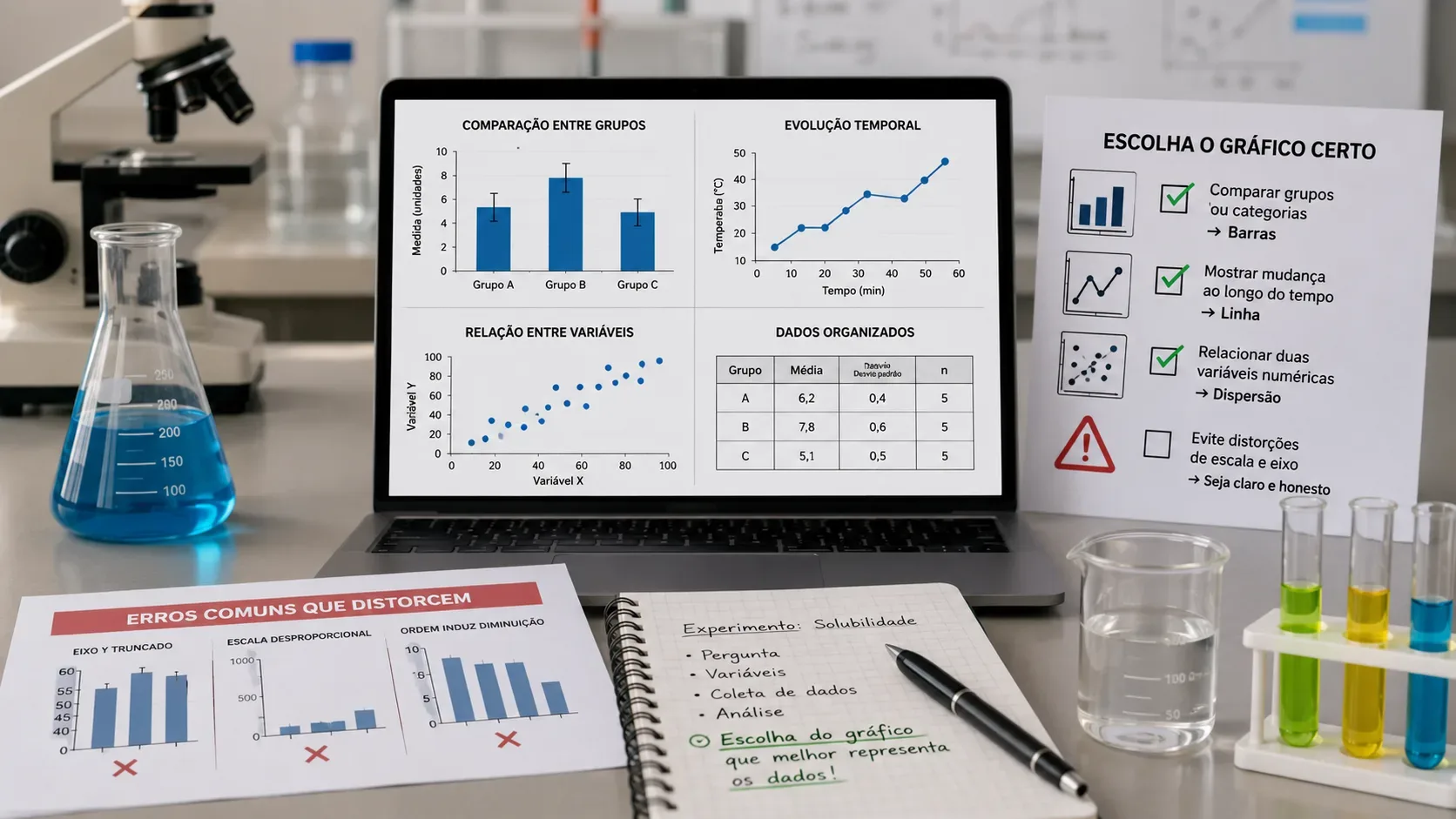
If the reader needs to check exact values, start with a table. If the question is visual, choose the graph according to the relationship in the data: bars to compare groups or categories, a line to follow change over time or another continuous sequence, and a scatter plot to see how two numerical variables vary together. In a school experiment, tables and graphs do not compete: the table preserves the values; the graph highlights patterns.
The Science Buddies data analysis guide recommends choosing the graph type according to the experiment, identifying units, using an appropriate scale and, in general, placing the independent variable on the x-axis and the dependent variable on the y-axis. Statistics Canada also notes that tables provide greater detail and precision, while graphs make comparisons and trends easier to see.
A quick decision tree
| Question you want to answer | Most useful presentation | School example | Common mistake |
|---|---|---|---|
| What were the exact values in each test? | Table | Three mass measurements for each material | Reducing everything to an average and hiding the original measurements |
| Which group or condition had the higher or lower result? | Bar chart | Average plant height under three light conditions | Using a truncated axis and exaggerating small differences |
| How did the result change over time? | Line graph | Water temperature measured every minute | Connecting points that do not form a real sequence |
| Do two numerical variables appear to vary together? | Scatter plot | Amount of fertilizer versus plant height | Treating a visual association as proof of cause |
Before choosing a graph, identify the variable types
The choice becomes easier when you separate categories from numbers. “Soil type,” “battery brand” and “treatment group” are categories. Time, temperature, mass, height and concentration are numerical variables. Then ask which variable you manipulated or set and which one you measured as the outcome.
As a general rule in simple experiments, the independent variable goes on the x-axis and the dependent variable on the y-axis. That does not mean every data set should become a graph: if the goal is to let a teacher check measurements, repetitions, units or calculations, a table is often essential.
When a table is the best choice
Use a table when precision matters more than the visual shape of the pattern. It is especially useful for raw data, repeated trials, different units or several measurements linked to one condition. For example, if you tested three times how long a tablet takes to dissolve at each temperature, the table can show all three trials, the average and the time unit without hiding variation between trials.
A good table needs a clear title, concise headers and units. If you calculate an average, percentage or another summary measure, keep the original values available whenever possible. Science Buddies recommends reviewing the data, checking for errors and calculating averages for repeated trials when appropriate.
When to use a bar chart
A bar chart works best when you want to compare categories or experimental groups. If the independent variable is not numerical — for example, “low light,” “medium light” and “high light” treated as distinct conditions — bars let the reader compare the outcome of each group quickly.
Do not connect the bars with a line: that would imply continuity that the categories may not have. If you are showing averages from repeated trials, clearly state that each bar represents an average and, if the level of the project allows, add a measure of variability explained in the text or legend.
The critical issue is scale. In bar charts, the visual reference is the bar length. For that reason, the Office for National Statistics (ONS) recommends starting the quantitative axis at zero. Cutting off the baseline can make a small difference look huge.
When to use a line graph
Use a line when the points have a real order and you want to emphasize change. Time is the most common case: temperature by minute, growth by day, battery voltage over several hours. The line helps the reader follow direction, trend and changes between successive measurements.
Be careful with unequal intervals. If measurements were taken at 0, 1, 5 and 20 minutes, the spacing on the x-axis should reflect those distances. In spreadsheets, an XY chart with lines can represent a numerical axis more faithfully than a line chart that treats each label as an equally spaced category. Science Buddies specifically points out this distinction for time-series data.
Unlike bars, a line graph may use an axis that does not begin at zero when that makes a trend easier to read, as long as all points are included and the scale is clear. The goal is not to make the variation look larger or smaller than it really is.
When to use a scatter plot
A scatter plot is the natural choice when you have pairs of numerical values and want to investigate a relationship: temperature and reaction speed, applied mass and deformation, hours of light and growth. Each point represents a pair of measurements without forcing a category to become an artificial number.
An upward, downward or curved pattern may indicate association. But association by itself is not proof of causation. The NIST notes that scatter plots help detect relationships but do not prove cause and effect on their own. A causal conclusion depends on experimental design, controls and other evidence.
How to avoid scale and axis distortions
- Show units. Write “time (s),” “mass (g)” or “temperature (°C)” instead of making the reader guess.
- Do not mix scales without converting. If some data are in liters and others in milliliters, standardize them before comparing.
- For bars, start at zero. This preserves the visual proportion of the bar lengths.
- For line and scatter plots, choose limits that show the data without dramatizing differences. An axis does not always need to start at zero, but any crop should be obvious and justified.
- Keep scales consistent in comparable graphs. Two side-by-side charts with different axes can lead to a false comparison.
- Do not force continuity. Categories do not become a sequence just because they can be numbered.
- Avoid 3D effects and decoration that change perception. The visualization should help the data, not compete with them.
Statistics Canada best-practice guidance reinforces that data type, message and scale all affect chart choice and recommends avoiding features that interfere with interpretation. The ONS also recommends consistent scales when comparable charts appear together.
One experiment may need both a table and a graph
Imagine an experiment measuring plant height for four weeks under three light conditions. The table can store every weekly measurement for every plant. A line graph can show how height changes across the weeks. At the end, a bar chart can compare the final average height across the three conditions. If the question changes to “are more hours of light associated with more growth?”, a scatter plot of light hours versus growth may be more informative.
So the choice does not depend on which format looks more “scientific,” but on the question the data need to answer. Using more than one presentation is valid when each serves a different purpose and does not repeat information unnecessarily.
Checklist before submitting the project
- Does the visual type match the experiment question?
- Are important raw data still available in a table?
- Do the axes have names and units?
- Is the independent variable on the x-axis and the dependent variable on the y-axis when that convention applies?
- Does the scale include all data without exaggerating differences?
- Do bar charts start at zero?
- Are time intervals or other numerical intervals spaced correctly?
- Are legends, symbols and series easy to distinguish?
- Are missing values or excluded results identified rather than simply disappearing?
- Does the graph show only what the data support, without turning association into causation?
If those answers are clear, the visualization is doing what it should: making the result easier to understand without changing the story the data tell.