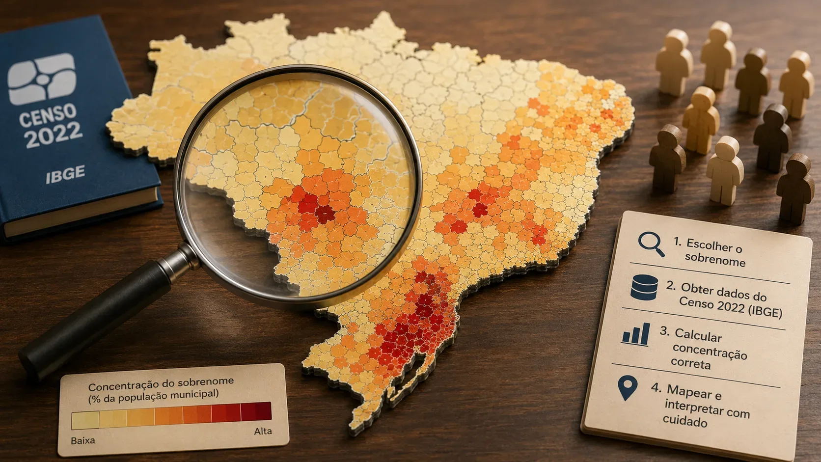
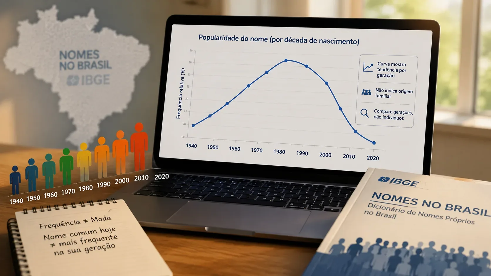
If you want to find out in which decade your first name became more common, IBGE's Nomes no Brasil curve is a good starting point — as long as you read it for what it actually measures. The tool uses residents enumerated in Brazil's 2022 Population Census and organizes first names by period of birth. A peak in a given decade therefore means that, among people living in Brazil on the Census reference date and included in that query, more people with that first name were born in that period. It does not automatically mean that this was the decade when the name was most “fashionable” among all babies born in the country.
What IBGE's decade curve shows
IBGE says that the Nomes no Brasil release based on the 2022 Census organizes information by sex and period of birth for Brazil, states and municipalities. When you look up a first name, the timeline lets you see how its frequency changes across birth periods. IBGE's educational page also notes that users can see how a name appears across decades and compare it with the names of parents, grandparents and friends.
In practice, the safest reading is: each point on the curve represents how many people enumerated in 2022, with that first name, belong to a given birth period. If the line rises from one decade to the next, there are more people with that name in the later group; if it falls, there are fewer.
Why “higher frequency” is not a perfect synonym for “more fashionable”
“Frequency” is a count. “Fashion,” in the everyday sense of naming trends, refers to parents' relative preference during a period. The two can move together, but they are not identical.
- Generation sizes change. A decade with more births can produce more people with a given name even without an equally strong proportional increase in preference for it.
- The Census observes who was a resident on August 1, 2022. It is not a complete historical register of every birth that ever occurred. Older cohorts are affected by mortality over time; migration and other population movements also influence who was living in the country on the reference date.
- The 2020s are incomplete at the Census date. Because the reference date is in 2022, that period contains only the first years of the decade and should not be compared as if it covered a full ten years.
So the highest point on the curve is excellent for answering “which birth period contains the largest number of enumerated residents with this name?”, but it needs caution before becoming “this was when the name was most fashionable.” To measure relative preference rigorously, you would ideally relate the name's frequency to the total number of births or the size of the corresponding cohort.
How to read the curve in four steps
- Find the peak. Identify the period with the highest frequency. This is the high point of the name's presence among enumerated residents, by birth period.
- Look at the shape, not only the maximum point. A rapid rise suggests a concentrated gain in popularity; a plateau points to persistence across more than one period; a long decline suggests reduced presence among younger generations.
- Compare neighboring decades. A peak only slightly above the previous decade can indicate stability, while a large jump can signal a stronger generational shift.
- Check the limitations before concluding. Make sure you are comparing complete decades, that the name is frequent enough to be displayed, and that the query refers to Brazil, a state or a municipality.
Hypothetical example: a peak alone does not prove a “preference record”
Imagine a name whose curve shows 12,000 people born in the 1980s, 20,000 in the 1990s and 18,000 in the 2000s. The direct reading is that, among 2022 Census residents with that first name, the largest group was born in the 1990s. That supports saying that the observed frequency peaks in that decade.
But without knowing how many people were born in each period and what share received the name, those three figures alone do not prove that parents in the 1990s chose it at a higher rate than parents in the 2000s. The difference between 20,000 and 18,000 may reflect both naming preference and the size and composition of the observed generations.
How to compare your name with your parents' and grandparents' names
Generational comparison works best when you look at the shape of the curve, not just the total number of people. A name strongly associated with one generation may be concentrated in one or two decades and then decline. Another may remain frequent across many decades, indicating more persistent use.
When mentally placing your name next to relatives' names, ask:
- does the peak occur at the same time or in different generations?
- was the rise abrupt or gradual?
- does the name fade quickly among younger cohorts or remain stable?
- does the curve have one clear peak or several similarly strong periods?
This comparison can describe a name's generational profile. It does not prove kinship, ancestry, ethnic origin or the reason a particular family chose that name.
The 2022 Census is not a genealogy database
IBGE's Technical Note 01/2025 explains that the release is based on the household resident list on the Census reference date. For the “name” field, collection could record a first name or compound given name, but for dissemination purposes only the first name reported was considered. The tool therefore does not reconstruct family lines and should not be used to infer that people sharing a first name have the same family origin.
It is also important not to mix first names and surnames. The product treats them differently: the birth-period series is especially useful for given names, while surnames are more naturally read through frequency and geographic distribution.
Rare names may not appear
IBGE Educa states that, for Brazil as a whole, only names with a frequency of at least 20 are displayed. The absence of a name from the tool therefore does not mean that nobody has it; it may simply fall below the publication threshold.
This also calls for caution with very fine comparisons. The lower the frequency, the more likely the visualization is to be constrained by dissemination and statistical-protection rules.
What you can conclude — and what to avoid
| Safe reading | Reading that requires caution |
|---|---|
| “Among enumerated residents with this name, the largest group was born in the 1990s.” | “This was definitely the name parents chose at the highest proportional rate in the 1990s.” |
| “The curve rises sharply between two decades.” | “A specific celebrity caused the increase,” without additional evidence. |
| “The name appears concentrated in one generation.” | “People with this name share a particular family or ethnic origin.” |
| “The name remains frequent across several decades.” | “Preference remained exactly stable,” without adjusting for cohort size. |
A simple way to answer “what was my name's decade?”
Use the curve to identify the birth period with the highest observed frequency and describe the result with that level of precision. Then look at neighboring decades to determine whether you see an isolated peak, a plateau or a long trend. If you want to talk about “fashion,” treat it as an interpretation: the curve is strong evidence of generational change, but by itself it does not measure the share of all babies who received the name in each decade.
That distinction makes the tool more useful. It becomes more than a curiosity about “how many people share my name” and works as a window into changing preferences across generations — without turning a Census count into a genealogical conclusion or into a naming rate the graph alone does not provide.