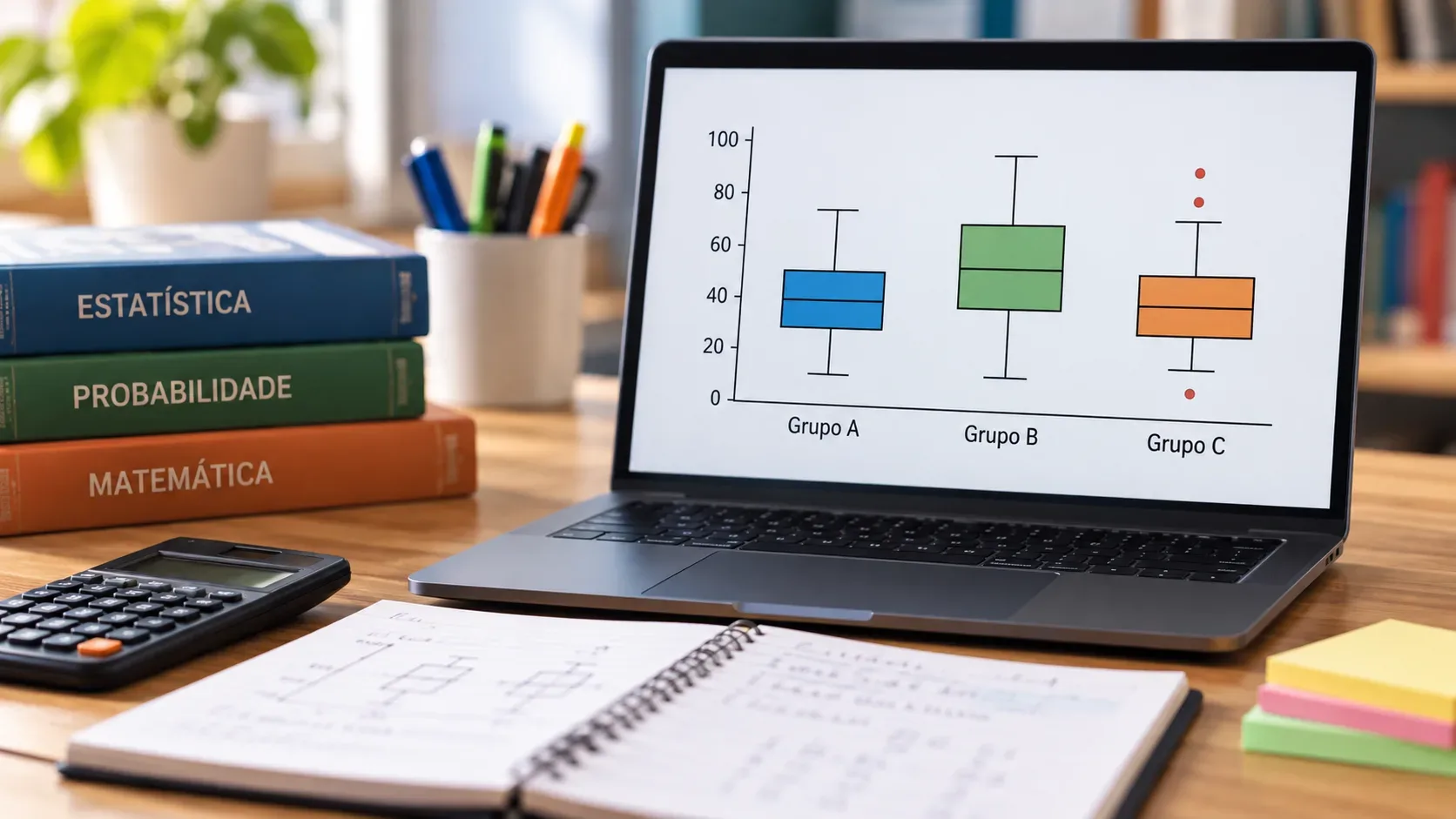
A boxplot becomes much easier to read when you stop trying to memorize every line and start treating it as a map of a distribution. The practical order is: first the scale; then the box; next the median; then the whiskers; finally, any isolated points. The box summarizes the middle 50% of the data, the median locates the center by rank, and the interquartile range measures the spread of that middle half.
This reading strategy works both for identifying values in a single graph and for comparing groups. The most important point is not to demand information that the boxplot does not show: in general, it does not provide the mean, does not reconstruct every observation in the sample, and does not automatically turn an isolated point into an “error.”
The mental map of a boxplot
A boxplot can be horizontal or vertical. In either orientation, find the scale on the axis that carries the values and locate Q1, the median, and Q3 on that scale. Materials from Fluminense Federal University present the boxplot through quartiles and note that there are variants in how extremes and unusual values are represented. NIST likewise describes the box between the quartiles and the median line as core elements of the graph.
| Element | What it represents | Common trap |
|---|---|---|
| Q1 | First quartile; approximately the point below which one quarter of the observations lie. | Confusing Q1 with the minimum. |
| Median (Q2) | Center by rank; it splits the distribution into two halves. | Treating it as if it must be the mean. |
| Q3 | Third quartile; approximately the point below which three quarters of the observations lie. | Confusing Q3 with the maximum. |
| Box | Runs from Q1 to Q3 and contains the middle 50% of the data. | Interpreting the visual width perpendicular to the scale as a data count when this is not stated. |
| IQR | Interquartile range: Q3 − Q1. | Confusing it with the total range. |
| Whiskers | Extend the reading beyond the box; their exact meaning depends on the graph’s convention. | Assuming they always reach the absolute minimum and maximum. |
| Isolated points | May indicate values classified as unusual under the rule being used. | Concluding that they must be errors or invalid data. |
First step: read the scale before the marks
In a problem, start with the axis. If the marks run from 0 to 100 in steps of 10, a median drawn between 30 and 40 must be estimated on that scale; it is not enough to look at its relative position inside the box. Also check whether the graph is horizontal or vertical and whether two boxplots being compared use the same scale.
The thickness of the box, meaning its dimension perpendicular to the value axis, should normally not be used to infer frequency. Some software allows variable-width boxplots, but that must be indicated. In school problems, the main information is usually carried along the numerical scale.
Example 1: identify the median, quartiles, and IQR
Consider a horizontal boxplot in which the left whisker ends at 10, Q1 = 20, the median = 30, Q3 = 45, and the right whisker ends at 60. No isolated points are shown.
- What is the median? 30.
- Between which values does the middle 50% lie? Between 20 and 45, because those are Q1 and Q3.
- What is the interquartile range? IQR = 45 − 20 = 25.
- What does the box let you state? The middle half of the data spans 25 units.
If the prompt states that the whiskers represent the minimum and maximum, the total range would be 60 − 10 = 50. But in a boxplot that handles outliers separately, the whiskers may stop at the most extreme values that have not been classified as outliers. That is why the convention must be read before turning the whisker-to-whisker distance into the total range.
What the interquartile range actually measures
The IQR measures the spread of the middle 50%: the larger Q3 − Q1 is, the more spread out the central half of the distribution is on the observed scale. It is useful for comparing groups because it is not driven directly by the most extreme values.
A small IQR does not mean that all observations are close together, and a large IQR does not, by itself, tell you where the minimum and maximum are. It also does not provide the mean or the standard deviation. When comparing groups, the safest question is: which box is longer along the scale? That box has the greater central spread.
Example 2: compare location and spread between groups
Suppose two groups measure the same variable on the same scale:
- Group A: Q1 = 58, median = 65, Q3 = 72.
- Group B: Q1 = 50, median = 63, Q3 = 79.
Group A has a slightly higher median: 65 versus 63. The central spread, however, is very different. For Group A, IQR = 72 − 58 = 14. For Group B, IQR = 79 − 50 = 29. Therefore, Group B has a more spread-out middle 50%.
This does not allow you to say that every observation in A is larger than every observation in B. The boxes may overlap and the distributions may share values. You also cannot infer sample sizes from standard box widths unless the graph explicitly says that width encodes the number of observations.
Outliers: the common 1.5 × IQR rule
A widely used convention, described by NIST, defines inner fences from the interquartile range:
- Lower fence: Q1 − 1.5 × IQR.
- Upper fence: Q3 + 1.5 × IQR.
Values beyond these fences may be marked as possible outliers. In this version, the whiskers usually reach the smallest and largest values that remain within the fences, while outside points are plotted separately. There are, however, other boxplot conventions and different quartile calculation methods; in an exam or software output, follow the rule stated in the prompt or legend.
Example 3: test a possible outlier
Consider Q1 = 40, median = 50, and Q3 = 60. Then IQR = 60 − 40 = 20. Under the 1.5 × IQR rule:
- lower fence = 40 − 1.5 × 20 = 10;
- upper fence = 60 + 1.5 × 20 = 90.
A value of 95 lies above 90 and, under this rule, is a possible outlier. A value of 85 would not be classified as an outlier by this criterion.
The point at 95, however, does not prove that a measurement or typing error occurred. It may be a legitimate rare value, may indicate a subgroup, may reflect a process change, or may indeed result from an error. The correct reading is: “this value deserves investigation under the chosen rule.” Automatically deleting an outlier without context can remove relevant information.
What a boxplot can — and cannot — support
- It can compare location: higher medians indicate a higher center by rank on the scale.
- It can compare central spread: longer boxes along the scale indicate a larger IQR.
- It may suggest asymmetry: an off-center median and very unequal whiskers are clues, not a complete description of distribution shape.
- It may highlight unusual values: if the chosen convention plots them separately.
- It does not automatically show the mean: the standard inner line is the median unless stated otherwise.
- It does not reveal every data point: different distributions can produce similar boxplots.
- It does not explain the cause of an outlier: the graph flags an unusual observation under a rule; the cause depends on context.
A 20-second routine for solving boxplot questions
- Read the scale and the unit.
- Locate Q1, the median, and Q3.
- Compute IQR = Q3 − Q1 if the question asks about central spread.
- When comparing groups, compare medians first and then IQRs.
- Inspect whiskers and isolated points, but confirm which convention the graph uses.
- Answer only what the boxplot supports: do not invent the mean, sample size, or a cause for an outlier.
Why it is better to practice reading than memorizing
The institutional page for the Enem Reference Matrices states that the document establishes the exam’s conceptual structure, identifies cognitive axes such as problem solving, and details competencies and skills for Mathematics and other subject areas. This does not mean that a specific boxplot is guaranteed to appear on an exam, but it reinforces the importance of extracting information from quantitative representations instead of depending on a memorized list of rules.
In practice, the most efficient reading sequence is always the same: location, spread, comparison, and caution with inferences. If you know where Q1, the median, and Q3 are, you can obtain the IQR; if you understand what the box represents, you can compare groups; if you know the outlier rule being used, you can identify values that deserve attention without automatically calling them errors.